
Why Visual Design Matters
In a crowded digital market, people often see a brand before they understand what it offers. They notice the logo, colours, photographs, typography and website layout before reading the details. These visual elements immediately communicate something about the business: whether it appears professional, approachable, creative, affordable or established.
Visual design does not replace a good product or service, but it affects whether potential customers feel confident enough to learn more.
A Logo Creates the First Point of Recognition
A logo acts as a visual signature. It helps customers recognise a business across its website, social media profiles, packaging and promotional materials.
An effective logo does not need to be complicated. In fact, simple logos are often easier to remember and use in different formats. A detailed design may look attractive on a large screen but become unclear when reduced to the size of a social media icon.
The design should also reflect the character of the business. A law firm may require a restrained and traditional identity, while a children’s brand can use more playful shapes and lettering. The objective is not to follow every design trend but to create a logo that suits the business and remains usable over time.
Colour Influences Mood and Expectations
Colour helps establish a brand’s mood. Blue is frequently associated with reliability and professionalism, while green can suggest health, nature or growth. Red often feels energetic and urgent, whereas black can communicate simplicity, authority or luxury.
However, colour meanings are not universal. Their effect can vary across cultures, industries, and contexts. A colour should therefore be chosen because it supports the brand’s identity, not simply because it has a popular psychological association.
A practical brand palette usually includes a primary colour, one or two supporting colours, and neutral shades for backgrounds and text. Good contrast is equally important. If text is difficult to read, an attractive colour combination becomes a barrier rather than an asset.
Website Design Affects Credibility
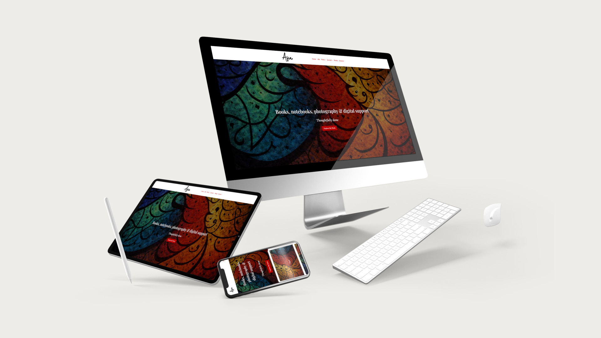
A website is often where customers decide whether to trust a business. Cluttered pages, inconsistent fonts, poor-quality images and confusing navigation can make even a legitimate company appear unreliable.
A well-designed website guides visitors towards the information they need. Headings should be clear, pages should load quickly, and contact details should be easy to find. The site must also work properly on mobile devices, since a design that looks polished on a desktop may be frustrating to use on a smaller screen.
Every visual choice should support the content. Large photographs can showcase products effectively, but they should not slow down the website or distract from essential information.
Consistency Builds a Recognisable Identity
A strong visual identity depends on repetition and consistency. Customers should encounter the same logo, colours, typefaces and general style wherever they find the brand.
A simple brand guide can document approved colours, font choices, logo variations, image styles, and basic placement rules. This is particularly helpful when different people create website pages, advertisements or social media graphics.
Consistency does not mean that every design must look identical. It means that each piece should feel as though it belongs to the same business.
Design Should Support the Brand’s Message
Successful visual design is not decoration added at the end. It is part of how a brand communicates. When the logo, colour palette, typography, images and website work together, they create a clear and credible impression.
The strongest design is not always the most elaborate. It is the design that accurately represents the business, serves its audience and makes the brand easier to recognise and trust.